Tonal Rendering Critique
In the Life Drawing Academy Correspondence Course, art students from various countries send us their drawings for critique together with questions they have. In this course, we provide unlimited personal tutoring, which includes full assessment of students' drawing skills, unique drawing curriculum that is custom-tailored for each student depending on one's skills and needs, 100 drawing tasks, full explanations and instructions on each task. We review every artwork students make within this course and provide constructive critique and advice on how to improve their drawing skills. All communication is in writing, so students will always have on hand every critique they receive and we recommend keeping our correspondence on file so they could refer to it at any time and check the advice given.
Here's an example of such communication between Mike, a Correspondence Course student from Greece and Vladimir London, Life Drawing Academy tutor.
Drawing and questions from Mike, Correspondence Course student
Dear Vladimir,
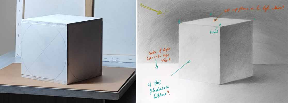
I started the rendering task with the cube and I wanted to clarify some points in order to improve it before moving on to other geometric bodies.
- Does the line AB closer to the corner at A point should be bolder or lighter? (Because light hits directly at this point.)
- Should the top plane remain all white?
- Is the gradation correct at the left light plane of the cube?
- Should the left side plane of the table that is at the light side be left white?
- How can I improve the background and overall rendering?
Best regards,
Mike
Feedback from Vladimir London, Life Drawing Academy tutor
Dear Mike,
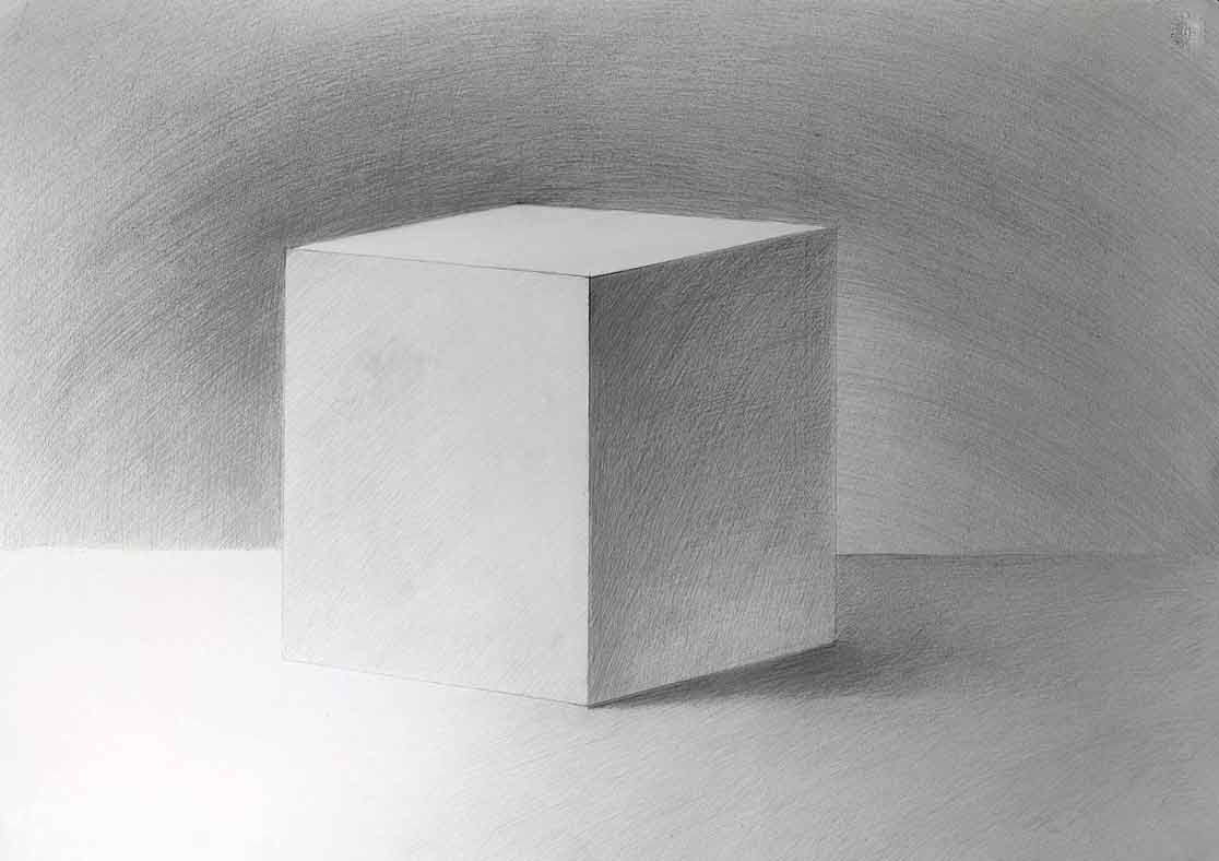
Thank you for your drawing and questions. Your tonal drawing of a cube is rather good; well done! There are, however, several things to improve.
Strictly speaking, the cube's edge should not be a graphical line at all, but a border between the light top and darker side planes. Nevertheless, you can draw it as a line. If you want to go hyper-realistic, you can even make this edge as a bevel, which will be the lightest stripe in this artwork because it directly faces the light source.
Talking of the cube's top side, totally white should only be a highlight, not the entire plane. Consider this - the top plane is not equally distant from the source of light. One part is closer than another, therefore a subtle gradient can be applied to differentiate the grounds.
The vertical plane on the left-hand side should be darker at the top and lighter at the bottom because reflected light bounces from the desktop and makes the bottom part lighter.
Also, you rendered this plane with pencil strokes that flatten this cube instead of revealing its depth. This goes back to the good and bad directions of contours. If you want to refresh this topic, let me know. I will explain in detail which contours of a cube are better to use and why.
The same logic applies to the gradient of the vertical right plane. Its bottom-left corner should be lighter because it reflects the light part of a ground and the rest of the bottom part, which reflects the casted shadow should be darker, but not as dark as the top part of this plane.
The desktop should not be white apart from the bevel of its edge, should you decide to include it into your drawing. The top side of a cube is closer to the light source, which is at the top and therefore the desktop will be a bit darker than the top of the cube.
Here's the mathematical explanation - the lightness diminished at a square of the distance to the light source. It means that an object twice further away from the light source will be four times darker. Of course, this theory has little to do with fine art, where an artist decides how to handle chiaroscuro depending on the creative task. Also, this equation does not count for reflected and diffused light.
When it comes to the background, you are doing it right - it should be darker at the light-side of the cube and lighter at its shadow side.
The way to improve rendering is to work on your style of hatching.
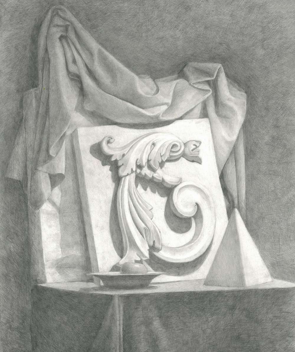
You may try various techniques. For example, rendering a background with shorter stokes at different angles in multiple layers; here's an example:
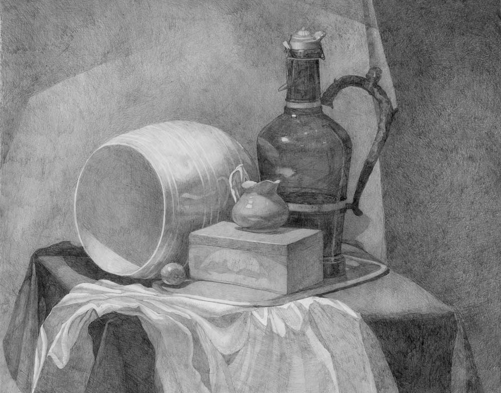
Or use a combination of stroke-less shading and even shorter cross-hatching on top:
I hope this helps. I will wait for your other drawings.
Kind regards,
Vladimir London
To learn good drawing techniques, enroll in the Life Drawing Academy course:
Online Course
A self-study, self-paced course for you to learn fundamental methods of classical drawing and improve life drawing skills by watching video lessons and doing assignments
- Unlimited access to 52 life drawing video lessons
- Lifetime membership without deadlines
- Unlimited support from the Academy tutors
- Constructive critique of your artworks
- Member access to the Academy's Art community
- Place in the Academy's Students Gallery
- Exclusive members-only newsletter and bonuses
- Life Drawing Academy Diploma of Excellence in your name
One-time payment - Lifetime membership
$297 USD
ENROLL NOW
Personal Tutoring Online + Online Course
The ultimate choice if you who would like to receive personal, one-to-one tutoring from the Academy teachers, which is custom-tailored to your skills and needs
- Everything in Online Course, plus:
- Dedicated team of art tutors
- Assessment of your current level of drawing skills
- Personalized curriculum tailored to your skills and goals
- Up to 100 drawing tasks with by-task assessment
- Unlimited one-to-one personal coaching with detailed per-task instructions and feedback
- Artwork critiques and results-oriented guidance
One-time payment - Lifetime membership
$997 USD
ENROLL NOW