How to Draw Clothes from Life
This is your unique chance to get unlimited personal tutoring at a tiny fraction of what it really costs.
Don't miss your once-in-a-lifetime opportunity
Enroll in the Life Drawing Academy now!
How to Draw Clothes from life
By Alexander Ryzhkin
In this video lesson, you will discover How to Draw Clothes from life with the full understanding of wrinkles and folds.
Questions and answers
Question:
What is the best way to hatch folds?
Answer:
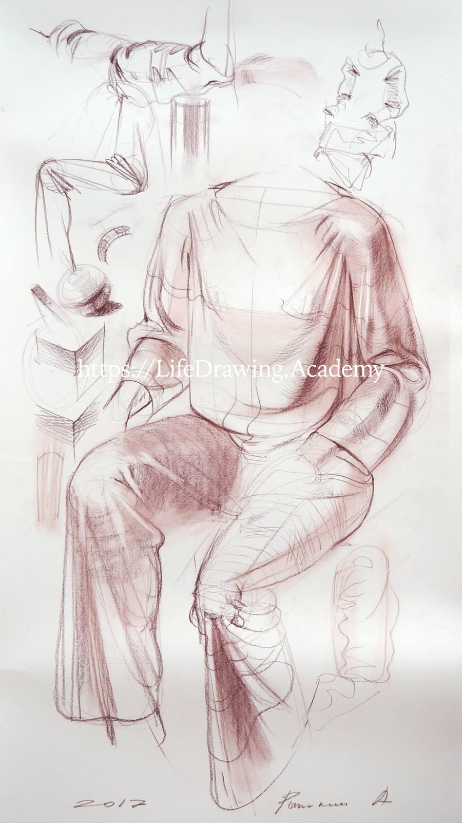
If you draw with a pencil and use separate strokes for rendering tonal values, the more you use cross-contours and apply hatching along those contours, the more information you can deliver about every fold and wrinkle. For example, here is the border of shadow on the model's shoulder. We can render it with multiple strokes. Each stroke goes cross-wise. Here's another place on the shoulder where the strokes follow the direction of the cross-contours. Whatever area you hatch, you can apply pencil strokes along the contours. That is why marking the cross-contours of wrinkles is so helpful. Do not be afraid of drawing contours. They can be easily diffused in multiple pencil strokes and disappear as stand-along lines. Make accents on borders between the planes where surfaces change their directions. As long as you follow the curvature and direction of contours, rendering will look descriptive, and the shapes of wrinkles will be believable. In places where one wrinkle fuses into another, the direction of contours will change, and so will the direction of strokes. In such places, you need to combine several directions of strokes that belong to different wrinkles. This presents an additional challenge, which is why rendering wrinkles is a rather slow process. At the same time, rendering the tonal values of draperies is a great exercise to develop your drawing skills.
When rendering tones in multiple layers, you can change the angle of strokes to achieve cross-hatching. Avoid a 90-degree angle, though. It is better to use 15- to 60-degrees angles. A cross-hatching angle should exaggerate a three-dimensional shape rather than flatten it. I will explain this principle using a cube as an example. Two sides of a cube can be rendered along their horizontal contours. You may also apply a second layer of strokes, this time cross-hatching at another angle. Such an approach emphasizes the geometry of the cube. However, not every angle of hatching is suited for the job. For example, if the second layer of cross-hatching is done at the wrong angle, it will flatten the object. So instead of revealing three-dimensional shape, we could diminish it if rendering is not done properly. This principle is one of the main rules when it comes to rendering draperies using cross-hatching. To emphasise the direction of planes, we can add cross-hatching using suitable angles between strokes.
Question:
How to depict cloth?
Answer:
There is one secret. A cloth is made of threads. A thread, depending on the material it is made of, has different reflecting qualities. If a cloth is absorbing light, then when it is folded, the edge will not have a highlight. However, a highly reflective cloth, like silk, has sharp highlights on folds. This is the same as when drawing metal objects. For example, a shiny cylinder will have highlights and reflected light in sharp contrast with the shadows. Such contrast suggests that the metal surface reflects light well. The same is true for threads. Silky threads, like metal cylinders, will have sharp contrasts between light and shadows. Fabric made of such reflective threads would also have strong tonal contrasts in every wrinkle and fold. Highlights are important part of tonal rendering. If your rendering is soft and gradual, you can use an eraser to make sharp highlights and create an appearance of silky texture. Highlights can be on the top of the hills as well on the bottom of the valleys of wrinkles. However, to render a velvety, non-reflective cloth, you should avoid making sharp contrasts and highlights.
Question:
Are all folds equally important?
Answer:
For example, a sleeve may have an impressive multitude of wrinkles. They are beautiful, but not all of them are needed. An artist has to make a decision on the hierarchy of folds. For instance, the wrinkle on the model's shoulder is important because it indicates the beginning of the deltoid muscle. The wrinkle at the end of the deltoid muscle is also important because it tells about the anatomy of the limb beneath the fabric. The wrinkles in between are less significant because they hold less information about the body. The wrinkle at the end of the biceps is also needed as it indicates where the volume of this muscle ends. The same can be said about the wrinkle where the biceps begin. Other wrinkles are less important. So, there are wrinkles that reveal body shapes and anatomy, and they are more important than other accidental, secondary wrinkles. A professional fine artist knows about this hierarchy and uses it to tell the story about a human body and actions this body is taking. This comes with experience. It doesn't mean that you have to draw only important wrinkles. If you want, you can depict all secondary wrinkles, as well, but make them less prominent. A good rule of thumb: you can start drawing with only the important wrinkles and keep others to the end, and then decide what to portray and what to omit to solve your creative task.
Avoid a junior mistake of drawing the precise contours of all wrinkles. Not all of them are informative and required. Also, not every part of a single wrinkle is equally important. The bottom of a wrinkle that touches the skin is more important than the top surface of the fold. The top of the hill is more or less random, while the bottom of the valley tells what shape the body has. So, your task as an artist is not to portray whatever you see, but to convey a message about the model's body using fabric. That is why deciding what wrinkles to draw and what wrinkles to skip is an essential part of thoughtful drawing. You can check drawings by the Old Masters to see how creatively they used folds and wrinkles to describe the shapes underneath the draperies. You will find that many masters did studies of folds very diligently, yet not every fold is equal in their masterpieces. The key wrinkles that hold information about a human body are always done with more stress and attention than secondary decorative wrinkles.
Question:
How to keep big forms while drawing small folds?
Answer:
There is a danger of getting lost in drawing multiple folds and losing the big shapes. Drawing should go from big volumes to smaller details.
If you draw in soft drawing materials like chalks, it is easier to render big areas by smudging pigment. If you use graphite pencils, it will take more time to render tones in strokes. Before going into the small details of folds, you can render overall tones of big shapes. For example, we can render the whole upper leg of a model using light pressure on a drawing chalk. And before continuing with folds, such under-rendering can be smudged with a piece of cloth to smooth the main tones without any attention to wrinkles. After that, you can spend much more time diligently examining every wrinkle and portraying its tonal values without a risk of stepping too far away in tonal value from main lights and shadows that are already in place. You can use an eraser to bring back highlights that were lost during smudging. In any case, it is helpful to use an under-layer of hatching of the big shapes before rendering individual wrinkles. The cycle can be repeated several times, from big forms to small details and then back to big forms once again. It may be tempting to render separate wrinkles, but uniting them into bigger volumes of a human body would be more challenging. Depicting small wrinkles may be interesting when you have a task of sketching the wrinkles on a model's clothing. However, if you plan to work for many hours, following the proper sequence of drawing steps would be more logical. After rendering wrinkles long enough, there will be a step when you need to unite them once again. To do so, you can apply longer strokes that span across several wrinkles. This is rendering big shapes as if there were no wrinkles there at all. Usually, such a step is required before applying the finishing touches. And of course, you need to keep in mind the hierarchy of folds...
[ The full lesson is avaibale to Life Drawing Academy members ]
This is your unique chance to get a lifetime academy membership and a dedicated team of art teachers.
Such unlimited personal tutoring is not available anywhere else.
Enroll in the Life Drawing Academy now!